Brand Systems &
Service Design
Joining a team of brilliant engineers with no visual identity — and building one from scratch until other offices started recognizing the logo.
Hall Installation
Physical brand activation — full-scale banner in the department hub, seen daily by 100+ employees.
Scroll through the delivered brand assets — environment, identity system, and motion.
The Challenge
I joined this team as the Marketing and Design lead. The team — data scientists, engineers, analysts — was genuinely sharp. Their work was good. Their presentations looked like every other internal deck. Their tools had no consistent style. No logo. No colors. No way for someone in another building — let alone another city — to know this department existed as a cohesive unit. In a company the size of Airbus, that kind of invisibility is a real liability. Good work doesn't speak for itself when nobody knows who made it.
So the job was clear: make the team visible. And make that visibility last beyond my time there — which meant building a system, not just a logo.
Building the Brand — and Everything Around It
A brand for an internal team inside a large corporation has to survive a lot of environments: dark digital dashboards, printed PDFs, factory floor signage, PowerPoint decks, small favicons. Every design decision had to work across all of them — which meant no trendy complexity, just deliberate simplicity that scaled. The tools used throughout were Adobe Creative Cloud: Illustrator for the identity system, Photoshop for physical assets, After Effects for motion.
1. The Identity System
The first decision was the color palette. Dark backgrounds with an electric orange — not the standard corporate blue, not a neutral grey. It was a deliberate signal: this is a data-driven, technically-minded team, and it should look like one. From there, the logo was built with four deliberate variants: full color for primary brand use, reversed for dark digital surfaces, monochrome for documents and print, and a minimal version for favicons, stamps, and constrained contexts. That's not decorative variety — it's the only responsible way to design a mark that has to live on a factory wall banner, a PDF report, a dashboard header, and a 16×16px favicon simultaneously.
2. Making It Physical
A digital brand without a physical presence stays invisible inside a factory building. To anchor the identity in the department's daily environment, a full-scale hall installation was designed and produced — a large-format banner in the main gathering space, visible to 100+ people every day. Deliberately minimal: the mark at scale, controlled negative space, maximum impact in a noisy manufacturing environment. The team also got branded hoodies — something small, but it matters more than people expect when you're building team identity from nothing.
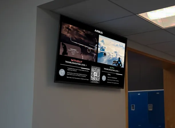
3. The Service Layer — Shopfloor Adoption
The department's mission was to digitize troubleshooting workflows on the Final Assembly Line. That meant getting assembly technicians — people who had been working with paper documents their entire careers — to scan QR codes instead. The design challenge here wasn't the technology. It was the service design: where do you physically place the codes so people actually see them? How do you format them for factory lighting and gloved hands? How do you communicate the change without a training session nobody has time to attend? How do you know if it's actually working? Every one of those questions had to be answered through iteration on the shopfloor, not in a design file.
The result was full adoption across the targeted teams — zero formal training required. The design did the explaining.
4. The Handoff — Sustainable by Design
A brand only matters if the team can maintain it after you're gone. Working with a practitioner intern, the brand was applied to the team's tools in Skywise, Slate, and Workshop — giving every product the same visual language. A newcomers guide was written alongside a colleague, covering the department ecosystem that had no formal onboarding material. A structured asset library was handed off: logo files in all variants and formats, usage guidelines, color tokens, and print-ready templates. Animated versions of the mark — built in After Effects for digital headers and presentation decks — ensured the identity could scale into motion contexts as the team expanded.
The moment that confirmed it was working: people from the Toulouse office started recognizing the team by the logo. In a company of that scale, cross-site visual recognition doesn't happen by accident. Eventually, as the team's scope grew, it was the right call to migrate into the official Airbus Design System. That transition felt less like giving something up and more like graduating.
Delivered
Impact summary
- Cross-site recognition: teams in other offices started identifying the department by logo — unprompted.
- 100% QR shopfloor adoption, zero formal training sessions.
- Hall installation visible to 100+ people every working day.
- Brand applied to all internal tools — Skywise, Slate, Workshop — by Carlos and a design intern.
- Full asset library handed off: the team maintained brand consistency independently after handoff.
- Eventually scaled into the official Airbus Design System as the department's scope expanded.